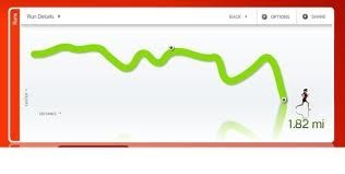
What it is:
A run chart is a graph that shows the changes in a process measurement
over time. It can help you:
. Recognize patterns of performance in a process.
. Document changes over time.
How to use it:
Construct the chart. Label the vertical axis with the key measurement of the process being measured.
Collect the data. Collect data for an appropriate number of time periods, in accordance with your data collection strategy.
Plot the data. Plot each data point on the chart.
Calculate and plot the average. This provides a reference for drawing conclusions about individual data points.
Interpret the chart. Interpret the chart using your knowledge of the process.Two possible signals that the process has significantly changed are:
. Six points in a row that steadily increase or decrease.
. Nine points in a row that are on the same side of the average.
. Other patterns to look for include significant shifts in levels, cyclical patterns and bunching of data points.
Repeat. Recompute the average for subsequent blocks of time, or after a significant change has occurred.


